
Stitchdown’s Boot camp
Ben Robinson of Stitchdown.com had an idea to create a premier live event series centered on quality shoes and boots. The name “Boot Camp” was already decided upon, the name being a literal translation of the event, a camp for boots. Ben needed help getting the name of his event away from the military meaning, needing a brand identity that leaned more into the camp than boot and needed creative design for the event.
Deliverables
Branding, Convention Materials & Custom Designs
Year
2023

The concept
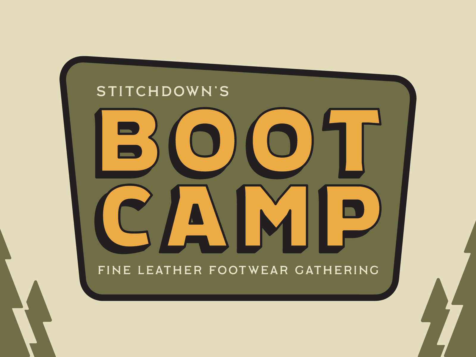
The design we moved forward with went heavy with the camp style of design. The main branding behind housed in the rhomboid shape of national park signs. The simplistic design of the main branding and the versatility of being able to remove the shape made it easy to bake in the logo to any convention signage, banner, or merchandise as well as any marketing material.
All the additional branding and design is to heighten the camp feel, while also bringing in elements of fine leather footwear. There are two versions of the “Badge” design, one being a patch you’d see a camper have and the other being the heel of a boot. A cursive version of the logo mark for the traditional Americana look something you could see on a baseball hat. Lastly, fun sticker like designs that are curated to resonate with the attendees of the event, Quality Rumps refers to shell cordovan leather which is made from the rump of a horse, and “Oh, Hey Nice Boots” being a common greeting between Stitchdown’s Discord community.


Type & Color
The fonts used for this project needed to be bold, fun, traditional, and versatile. Several fonts were decided upon to be used for the Branding and the subsequent convention designs. The main branding only uses Atrek and Labor Union, the weight difference between these allow for versatile hierarchy, attention grabbing, and traditional. The Chunk and Cubano are playful bold fonts that can be easily read across the room while being easy on the eyes when up close.
The colors for this branding take heavy inspiration from the United States National Park, which are deep and rich in color for visibility when outside on the trail. Color was also used to help distinguish what kind of sign a visitor would see during the event, and what kind of badge those attended carried helping them distinguish themselves between vendors, staff, exhibitors, and general admission.